Creating these posters required understanding target audiences and translating diverse inspirations into compelling designs. Through research, interviews, and creative exploration, I tailored each composition to resonate with its audience, reinforcing the importance of empathy, adaptability, and creative interpretation in design.
Posters (Various)
Visual Design
Advertising
Typography
Layout
Print
TIMEFRAME — 2 WEEKS eachBJORKThe gig poster for Bjork drew inspiration from her interview with poet Ocean Vuong, where she likened her album covers to "sonic tarot cards." Explaining the concept, she stated, "Tarot is something humankind has been using for thousands of years – symbols that everybody agrees on. Like, ‘Yes, I sometimes feel like I’m holding a cup, sometimes I feel like I’m holding an axe.”
Reflecting this idea, my design centers on recreating a tarot card, integrating imagery symbolizing pivotal moments throughout her career. This approach captures her artistic evolution over the past 25 years, highlighting the journey that has led her to become the iconic artist she is today.
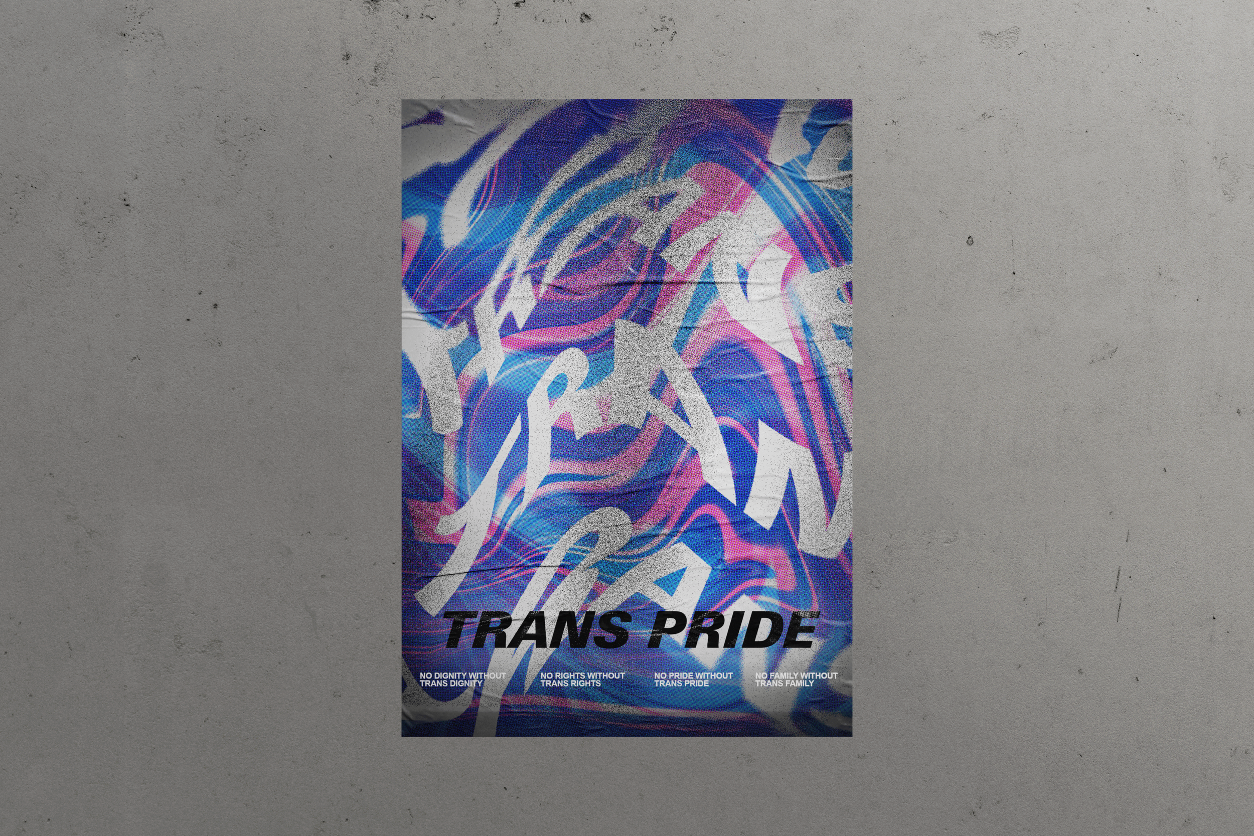
Trans PrideFor the Trans Pride poster, I aimed to create a design that embodied joy, resilience, and visibility. Rather than relying on traditional symbols, I drew inspiration from queer nightlife, using the reflection of a disco ball as a key visual element. The fragmented light and shimmering texture symbolize the multifaceted nature of trans identities—diverse, dynamic, and beautifully complex.
To enhance the sense of movement and celebration, I designed three color variations for street use. One features the traditional trans pride colors—light blue, pink, and white—while the others explore bold, high-contrast palettes that maintain the poster’s vibrancy while ensuring visibility in various urban settings. The typography is echoing the fluidity of light and identity. The result is a striking series of posters that not only capture the spirit of pride but also invite viewers to embrace the brilliance of trans existence.
blade runner 1982The target audience for this poster was dedicated fans of the cult classic. A key challenge was creating a striking poster without using images of the film’s characters while working within a limited color palette. My research involved watching the movie closely to identify its key themes, motifs, metaphors, and tone.
To capture the true fan’s attention, I focused on an iconic moment—Rachel smoking while speaking with Deckard—a scene that encapsulates the film’s exploration of replicants' emotional depth. By blurring the line between human and artificial intelligence, this imagery reinforces one of the movie’s central themes. The main title was seamlessly integrated into the composition, enhancing the visual impact while staying true to the film’s aesthetic.
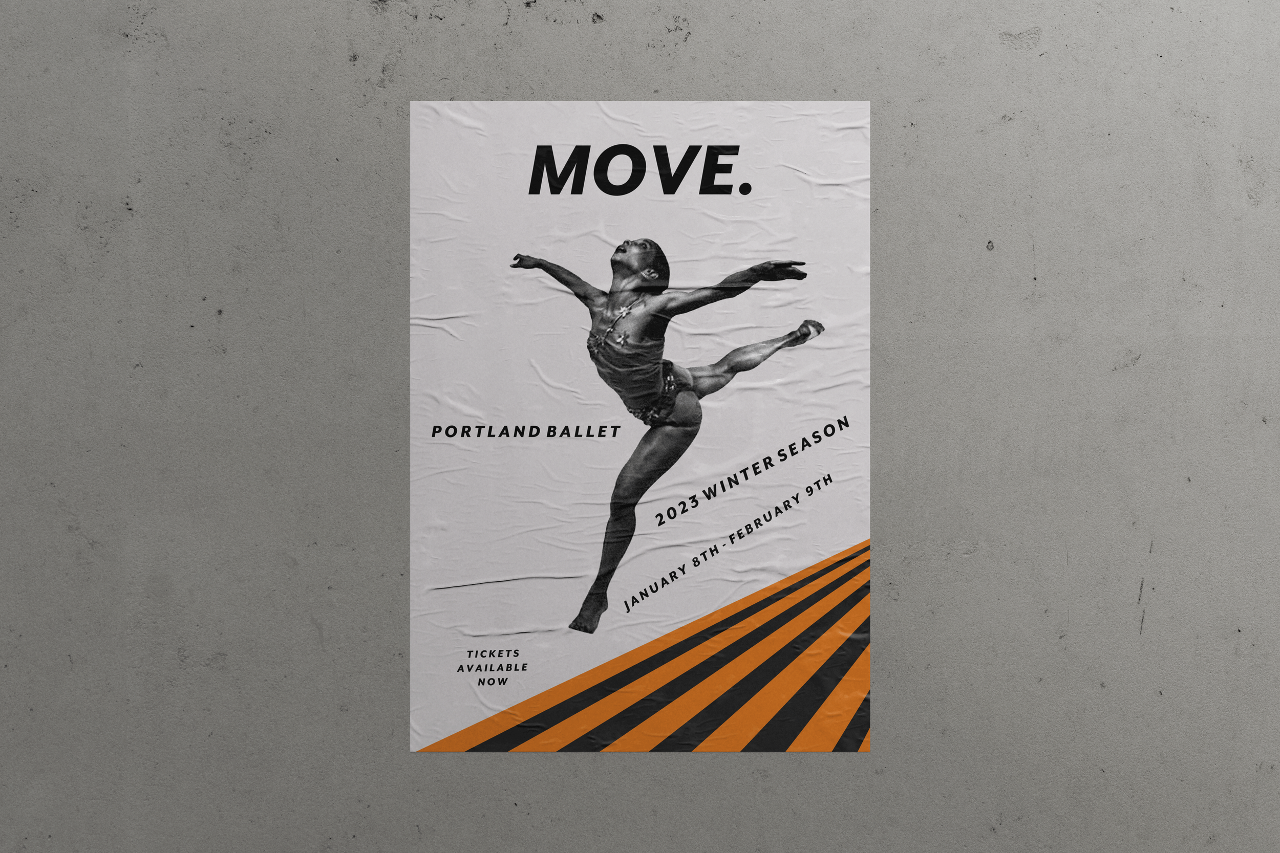
Portland ballet


